Claremont LMS
Conceptual redesign of the Claremont Colleges learning management system
Submit assignments from the homepage

Access timely information en route

Collaborate with peers from home or on the go

Visualize daily course events

Overview
In the Spring of 2022, I teamed up with three college peers to redesign Sakai, the Claremont Colleges Learning Management System (LMS). Serving over 8,000 users, our objective was to create a concept that simplified coursework management for students. After three months, we delivered our web and mobile redesigns to the IT department, who found our suggestions insightful. They indicated that the colleges would transition to Canvas LMS, influenced by many of the pain points we identified.
The Problem
Our survey of student opinions on Sakai LMS revealed difficulties in easily locating resources and assignments, hindering students’ ability to stay ahead in their coursework. Claremont students needed a more efficient way to find assignments and collaborate with peers to start their coursework with less frustration.

Kicking it off with discovery
We sent out a questionnaire to our peers and collected 36 responses. From these, we selected 10 students for interviews. The feedback revealed that 95% of students used Sakai on their desktop, and many faced navigability challenges in locating assignments and materials. Students also mentioned the outdated UI and expressed a desire to access coursework while traveling for sporting and club events.


Iterating and gathering feedback
With each iteration, I scheduled time to evaluate the new designs with students. I created prototypes for each iteration, allowing students to perform tasks like finding assignments and contacting peers on both mobile and web versions.

Challenge #1: Making assignments easier to find and incentivizing students to complete them
To incentivize students to complete assignments and make them easier to locate, I drew inspiration from Google Calendar and Gradescope—tools students already use for tracking assignments. In the Sakai redesign, I made the upcoming assignment calendar the landing page, allowing students to see due dates and submit assignments directly from there.
Reviewing the final designs for configuring a school's academic day structure with developers.

Challenge #2: Improving the discoverability of the most important information
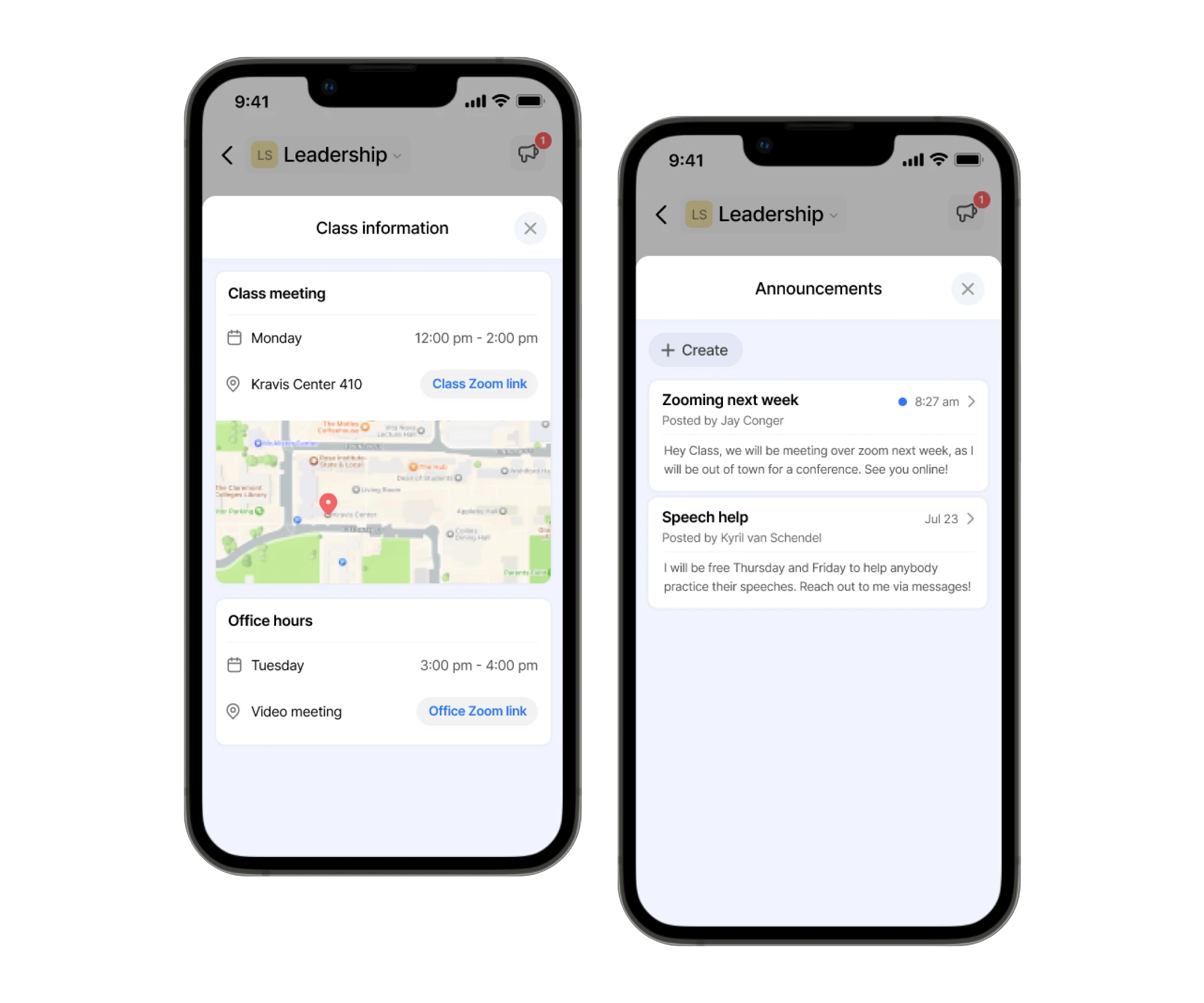
I aimed to simplify navigation and access to crucial information such as syllabi, announcements, and Zoom links on both mobile and web versions. I created a feed displaying a timeline of class and assignment events, with announcements and class information prominently featured at the top for easy access.
working on the layout of a generated school report with two designers from India

Challenge #3: Embedding Chat
The main challenge with messaging was its placement. While chats are usually tied to specific classes, I opted to place messaging at the top level, allowing students to respond from any screen. If a message pertained to a specific course, a course badge was added. On mobile, messaging was one of the three main menu items, as students frequently use their phones for communication.
The Apollo component library in Figma. Usage rules were documented in the company note taking app.

Evaluating the Designs
With each design iteration, I gathered feedback from students to refine the designs. Once the final designs were ready, I conducted usability tests with six students to compare the new designs against the current Sakai. We measured their ability to find assignment due dates, locate course syllabi, and contact peers.

Conclusion
This project was one of my first extensive UX redesigns, where I learned a great deal about the conventional UX design process and the importance of continuous research and user evaluation. After completing the final designs, I presented a case study of the new changes to the Claremont IT department. They appreciated the insights and informed me of the implementation constraints within the Sakai open-source community.

